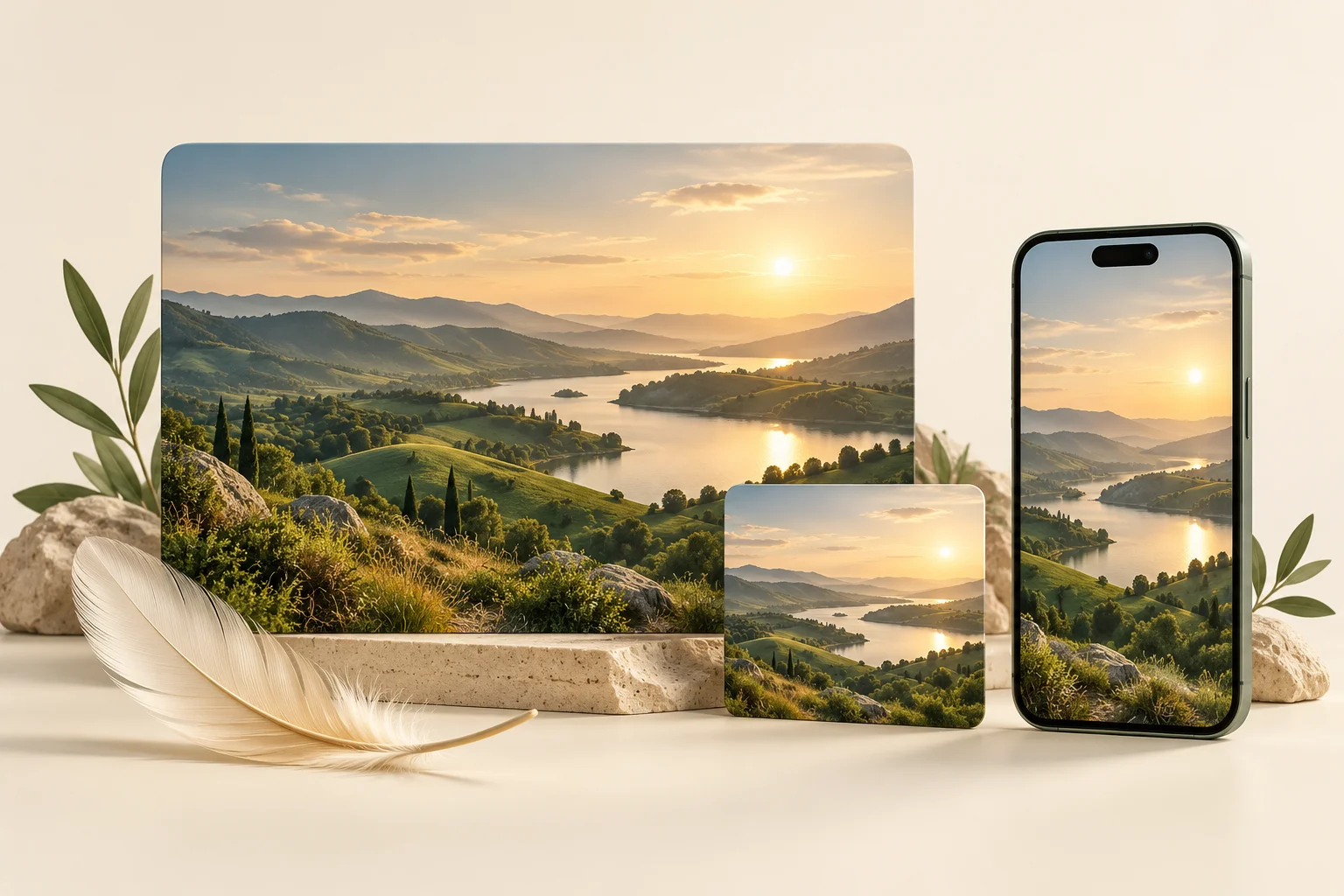
Your website images should help people judge your products and your work. If visitors have to wait for a huge download, or a mobile layout cuts off the important detail, the image is getting in their way.
This WordPress image optimization guide gives business owners a practical order of work: choose useful images, size them for the layout, preserve the right detail, and test what visitors actually receive. It applies to service websites, portfolios and WooCommerce stores. Official documentation reviewed on 28 October 2026.
1. Start with the image’s job
Before installing another plugin, list the images on one important page. Give each a purpose: explaining a service, showing a product detail, identifying a person, or supporting an article. Remove repeated decorative images that add download weight without helping someone make a decision.
For a product, ask what a buyer needs to inspect: shape, texture, packaging, scale or a specific feature. Keep that information visible. For a portfolio, a carefully composed project image can be more useful than a tall screenshot with unreadable text. Keep an untouched original outside your optimization workflow so you can create a different export later.
2. Match dimensions to the actual layout
An image’s pixel dimensions and its file size are different things. Reducing compression quality will not fix every oversized upload. First establish how wide the image appears on desktop and mobile, then create an export with enough pixels for that use, including higher density screens where appropriate.
As a planning example, an image displayed 600 CSS pixels wide might need a 1200-pixel version for a screen using two device pixels per CSS pixel. That is an example, not a universal upload rule. Product zoom, full-width banners and small cards have different needs.
WordPress can generate multiple image sizes and add srcset and sizes so browsers can choose a suitable file. Its responsive images handbook explains this system. A custom theme or page builder still needs suitable markup and layout hints. Ask your developer to inspect the file actually requested on a phone, rather than assuming the Media Library’s smaller copies are being used.
3. Compare formats without sacrificing detail
Try WebP or AVIF alongside your existing export and compare both appearance and bytes. Inspect small lettering, gradients, skin tones and product edges. If a label becomes hard to read, a smaller file has not produced a better product page.
WordPress introduced AVIF support in version 6.5; its official announcement from 23 February 2024 describes the original implementation. That is historical support information, not a recommendation to run that version. Check your current editor, hosting and optimization setup, then test that uploads and generated sizes work before a bulk conversion.
Choose one clear owner for resizing and conversion, whether that is your export process, a plugin or an image delivery service. Overlapping systems make it harder to understand which file is being served. Trial changes on a small group of images and keep a recovery path before processing the entire library.
4. Fix cropping separately from compression
If a portrait loses its head or a product loses its edges, the problem may be the display frame rather than the file. Compression cannot restore content that the layout hides. Also check whether the selected WordPress thumbnail was already cropped: a display change cannot recover pixels missing from that source.
For an image that must remain fully visible, use its natural aspect ratio or a bounded frame with object-fit: contain. A neutral background can make the spare space feel intentional. object-fit: cover fills a frame by cropping when the proportions differ. The MDN object-fit reference describes the distinction.
Use consistent card frames, but decide whether showing the whole image matters more than filling every corner. For product specifications, diagrams and project artwork, preserving the complete image is usually the safer choice.
5. Load the main image early and reserve its space
The large image near the top of a page may be its Largest Contentful Paint element: the largest visible image or text block during loading. Google’s LCP optimization guide advises against lazy-loading that image. Make it discoverable early; apply loading priorities selectively rather than marking every gallery image as urgent.
Images further down the page are candidates for lazy loading. Check the final page because themes, builders and plugins can alter loading behaviour. A hero that waits for a slider script can still appear late even after its file becomes smaller.
Give images accurate width and height attributes or reserve their aspect ratio in the layout. This helps prevent the text and buttons below them from moving when they arrive. See the official layout shift guidance. Responsive CSS can still let the image shrink to fit a phone.
6. Make images understandable and discoverable
Use a short descriptive filename and helpful alternative text. For example, “Green ceramic mug showing its handle and matte finish” explains a view more clearly than “best mugs buy mugs online”. Describe the information relevant to the page; avoid keyword lists.
Google recommends standard HTML image elements and useful contextual text in its image SEO documentation. Meaningful content images should not depend solely on CSS backgrounds. Accessibility and clarity come first; these steps do not guarantee rankings or traffic.
7. Check one page before rolling out
- Record the current page and image download sizes using browser developer tools.
- Optimize a small set of images, then compare the same page and test conditions.
- Open narrow and wide layouts. Check landscape and portrait images for lost detail.
- Test a fresh visit with mobile network throttling, not just a cached desktop reload.
- For WooCommerce, check gallery thumbnails, variation changes and zoom.
- Confirm alternative text, stable layout and early loading of the main image.
Use PageSpeed Insights as a diagnostic alongside visual checks. Keep changes that reduce unnecessary downloads while preserving what a customer needs to see. Once the image delivery is sound, review safe WooCommerce caching as a separate performance step.
Need help finding what is slowing down your WordPress site? Explore website development and support or let’s talk about your website.